Introduction
At Vancouver Island University (VIU), our brand is much more than a logo. Our brand is our values, our vision and the experiences we create for our community.
Our visual identity brings to life the deep connections and fresh perspectives we promise to deliver. It amplifies our brand story by visually communicating our commitment to support and inspire people and place, showcasing our ambition, humility and integrity in every visual element.
By consistently using our brand visual standards, we ensure that every piece of communication—whether it’s a brochure, website or social media post—reflects the unique attributes that define VIU. Through consistent use of these standards, we will build a unified and recognizable presence that strengthens our reputation and deepens our connections with our audiences.
Questions about the VIU brand? The Brand and Marketing department is here to help. Contact us by email at Brand@viu.ca.
Elements of our brand visual
Our brand is expressed visually through:
Typography
We use two typefaces:
- Proxima Nova
- Proxima Sera
The type on this page, and on all viu.ca pages, is Proxima Nova.
Proxima Nova shows we are clear, practical and modern.

Proxima Sera demonstrates we are experts in what we do.
Using type
Keep it simple. Avoid combining too many weights and colours. Examples of weights are bold, semi-bold, regular.
When to use Nova vs Sera
Nova is our primary font. It should always be present. Sera is secondary and optional.
Use Sera:
- to create visual interest
- when “expert & practical” is the primary trait
- when more formality is required
Headline fun
Our visual brand allows for a mix of Proxima Sera and Proxima Nova in headline text. And it allows us to add a brand colour into part of the headline text. It needs to be done in this way:
- Use Proxima Sera for most of the headline
- Accent words or phrased in Proxima Nova in bold and using a VIU brand colour
See the graphic device samples to see this approach in action.
Best practices for using type
Do not:
- change the colour of text if the type is not also changing
- mix fonts in a single word
- use all caps
- use full justification
Accessibility and type
- Avoid thin fonts over coloured backgrounds
- Avoid right justification
- Body copy is ideally 10 to 12 pt. Do not go below 8 pt
How to get Proxima Nova and Proxima Sera
You must download the fonts from the Company Portal. IT has instructions for using the Company Portal.
Graphic devices
The power of connection
When you walk around a VIU campus, you feel a deep sense of connection to the people, communities, mountains, ocean and forests that are all around you. It’s Ts’itsuwatul (Working Together) and Q’ushin’tul (Walking Together). Here, you’re part of something bigger. Lessons learned here, the relationships built here, and communities grown here will create ripples of change that extend from Vancouver Island to every corner of the world. We’re here to make a difference in each other’s lives and in our environment, and we do it together. That’s the power of connection.
To bring this idea to life, our graphic devices are built on the interconnection of people and place.
Waves
Waves connect to our flexibility and collective strength.

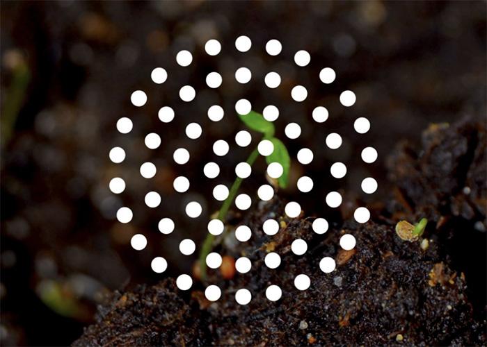
Seeds
Seeds embody our focus on growth, community and support.

Mountains
Mountains capture our confidence and ambition.
Ripples
Ripples represent our impact and our desire to create change.


Textures
The VIU brand visual also features textures built from nature images. Currently this visual is being implemented by only the VIU graphic design team. If you would like textures in your project, please contact Brand@viu.ca.

Samples of these graphic devices are available in the Marketing & Digital Engagement Community of Practice (CoP) Team. Not a member of the CoP? Email Brand@viu.ca to join.
Photography
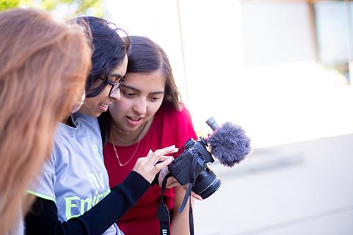
Our photography has a strong sense of place—it feels of the Island.
VIU photography is authentic and human, nothing overly filtered or posed. We capture the school experience and the Island experience, the connections between people and connections with nature. We show scenes from real life, genuine emotions and interactions. There is often a shallow depth of field and a sense of warmth. People are often not looking at the camera. Some images employ movement to create an in-the-moment feel. Some images crop in close to show detail and to bring the viewer into an interaction. There is often a sense of texture and tactility that comes through the images.

Iconography
Branded iconography is currently in development. If you need icons for your project email Brand@viu.ca.


